Pitt N Pawl
2024
Chajjed foods pvt ltd
online offline marketing/ Atl-btl creatives/packaging design/ nomenclature/ 3d character design
services
client
year
Visual identity

Perfectly Crisp, Perfectly Joyful
Fun faces created from our logo capture the essence of our snacks. Each face, crafted with a touch of whimsy, embodies the delightful crunch and joyful flavor that our products offer. This unique design not only highlights the fun and upbeat nature of our snacks but also connects visually with the happiness and satisfaction found in every bite. Through these creative faces, we celebrate the crispiness and joyful spirit of our snacks, making each product a memorable and entertaining experience.

Logo Symbol
The symbolic logo is made such that the initial ‘9’ is formed in the negative space that the overall letter ‘Y’ creates. It is deliberately made to look like a trophy to have the psychological effect of it being a place for winners. The overall composition of the letter ‘Y’ is also made with the same element used in the textual logo and used as the visual identity.

Visual Pattern Identity


Colors
The visual identity is as simple as it can get. It is the very element that makes the textual and symbolic and ties everything together beautifully. The simplicity itself makes it flexible enough to be used in numerous ways according to the requirements.
The symbolic logo is made such that the initial ‘9’ is formed in the negative space that the overall letter ‘Y’ creates. It is deliberately made to look like a trophy to have the psychological effect of it being a place for winners. The overall composition of the letter ‘Y’ is also made with the same element used in the textual logo and used as the visual identity.
Packaging Design

Making Every Snack Time a Happy Experience
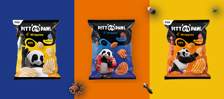
Our packaging design is a vibrant celebration of the fun and excitement our snacks bring. With bold, eye-catching colors and playful patterns, each package captures the lively spirit and joyful experience of our products. This dynamic approach ensures that our snacks stand out on the shelf and instantly convey the delicious, crisp flavor within, making every snack moment as visually engaging as it is satisfying.
.svg)


