Napmunks Mattresses
Napmunks is a luxury sleep brand built around comfort, care, and synergy — introducing a fresh narrative to modern rest. Inspired by the calm yet lively spirit of a chipmunk, the brand balances warmth with innovation, creating an identity that feels both indulgent and approachable. Napmunks represents elevated wellbeing — where thoughtful design, emotional comfort, and refined aesthetics come together to redefine luxury sleep for a new generation.
Branding & Collaterals
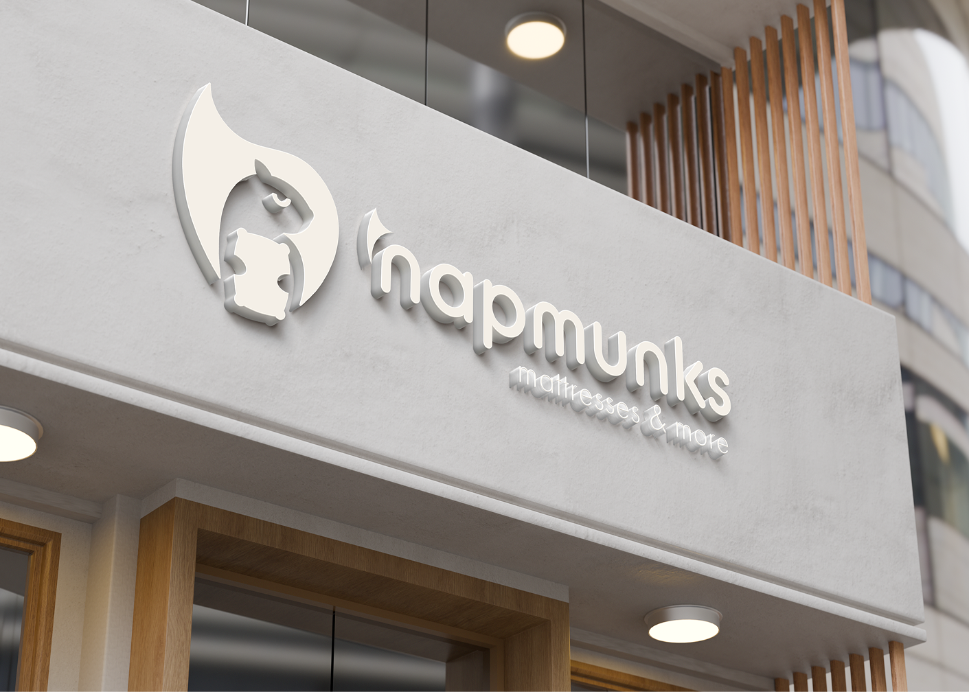
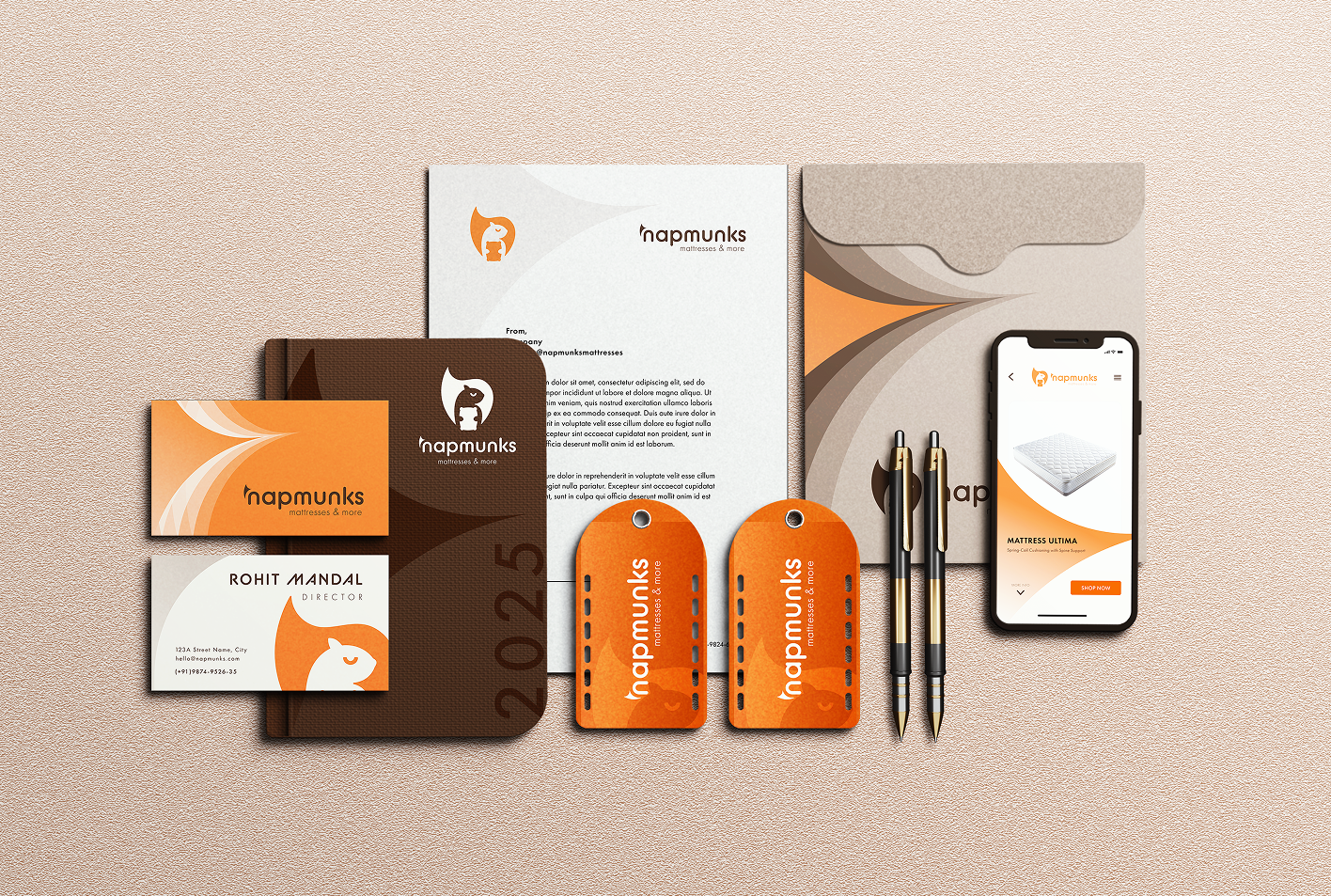
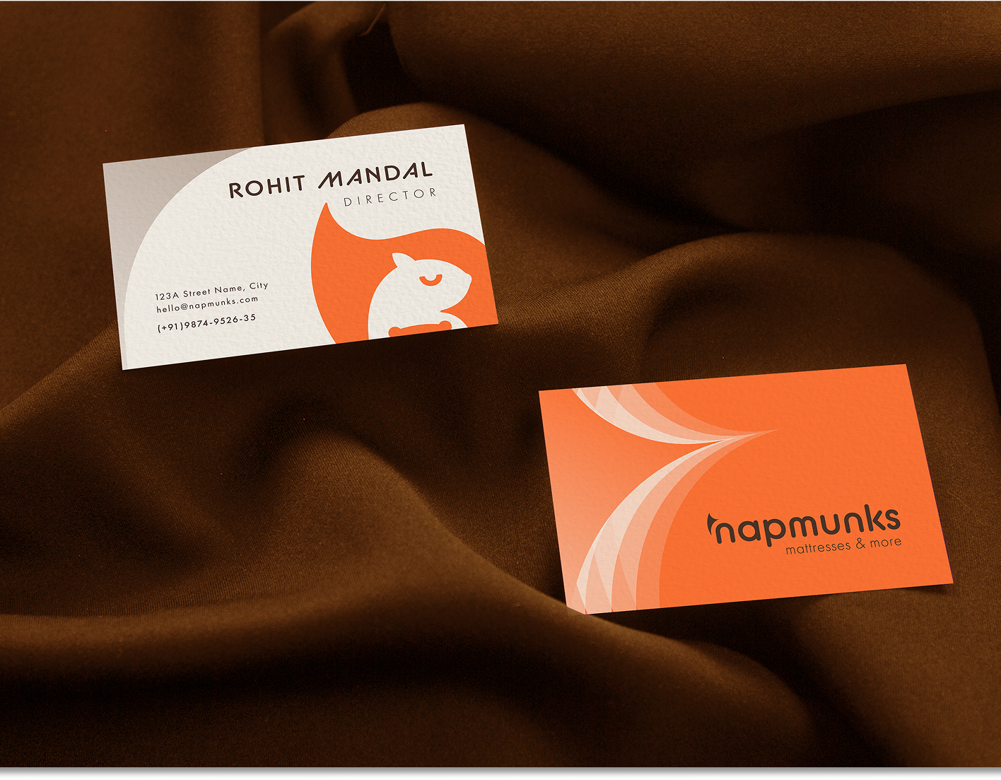
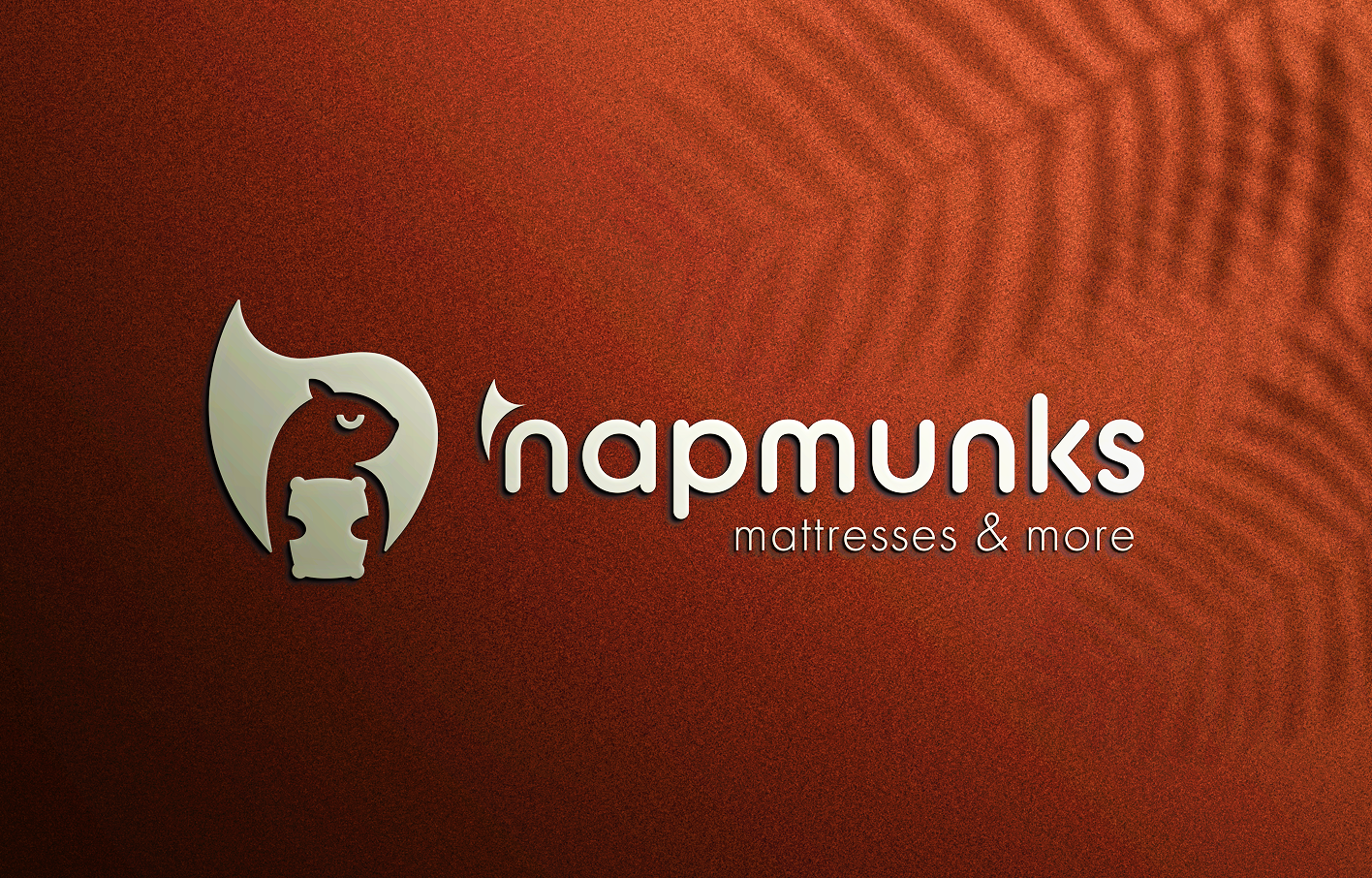
For Napmunks, we crafted a distinctive and emotionally intelligent visual identity rooted in symbolism and harmony. The logo integrates a calm chipmunk form with an ‘n’-shaped tail and a pillow element, subtly connecting the brand name with the promise of secure, restful comfort. The visual language extends through flowing, tail-inspired graphic motifs that suggest progression and upliftment, creating a dynamic yet minimal system. A warm, earthy color palette — led by Acorn Orange and grounded browns — establishes recall and luxury, while rounded typography balances confidence with softness. The result is a cohesive and flexible brand system that feels modern, premium, and deeply connected to the essence of restful living.

No items found.

.svg)


