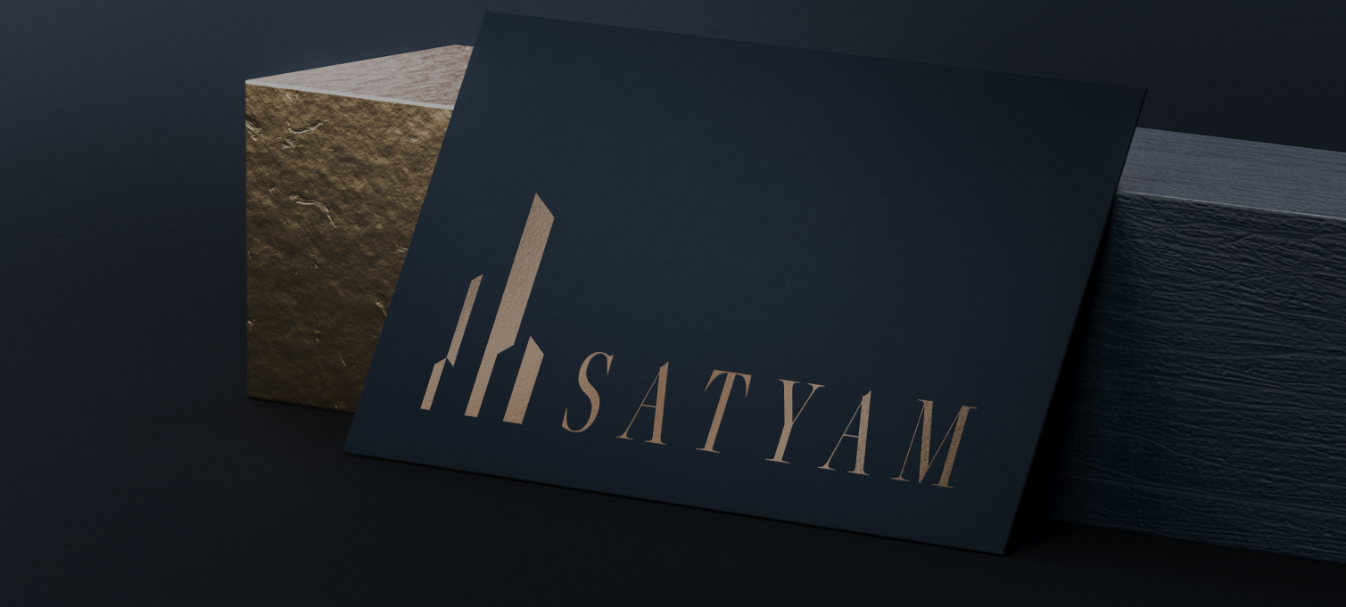
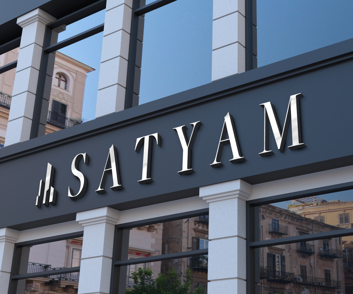
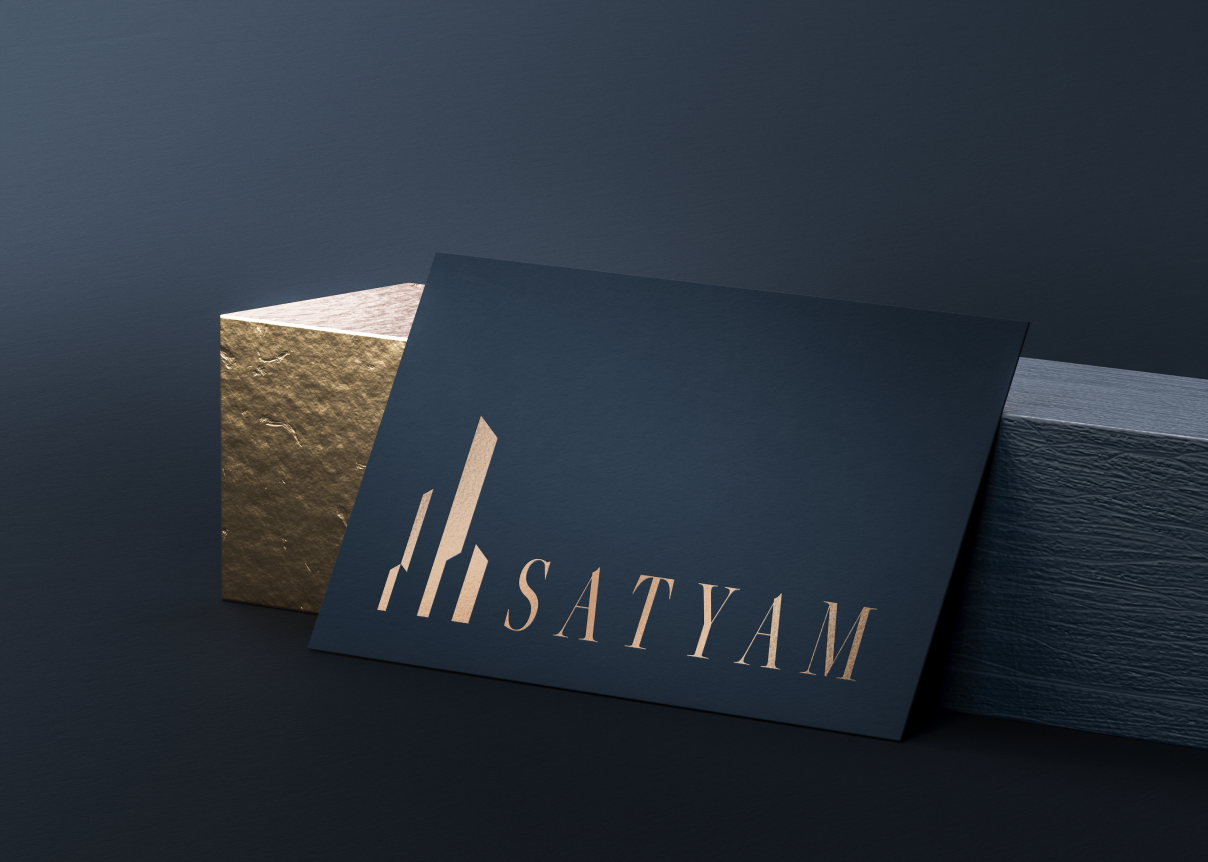
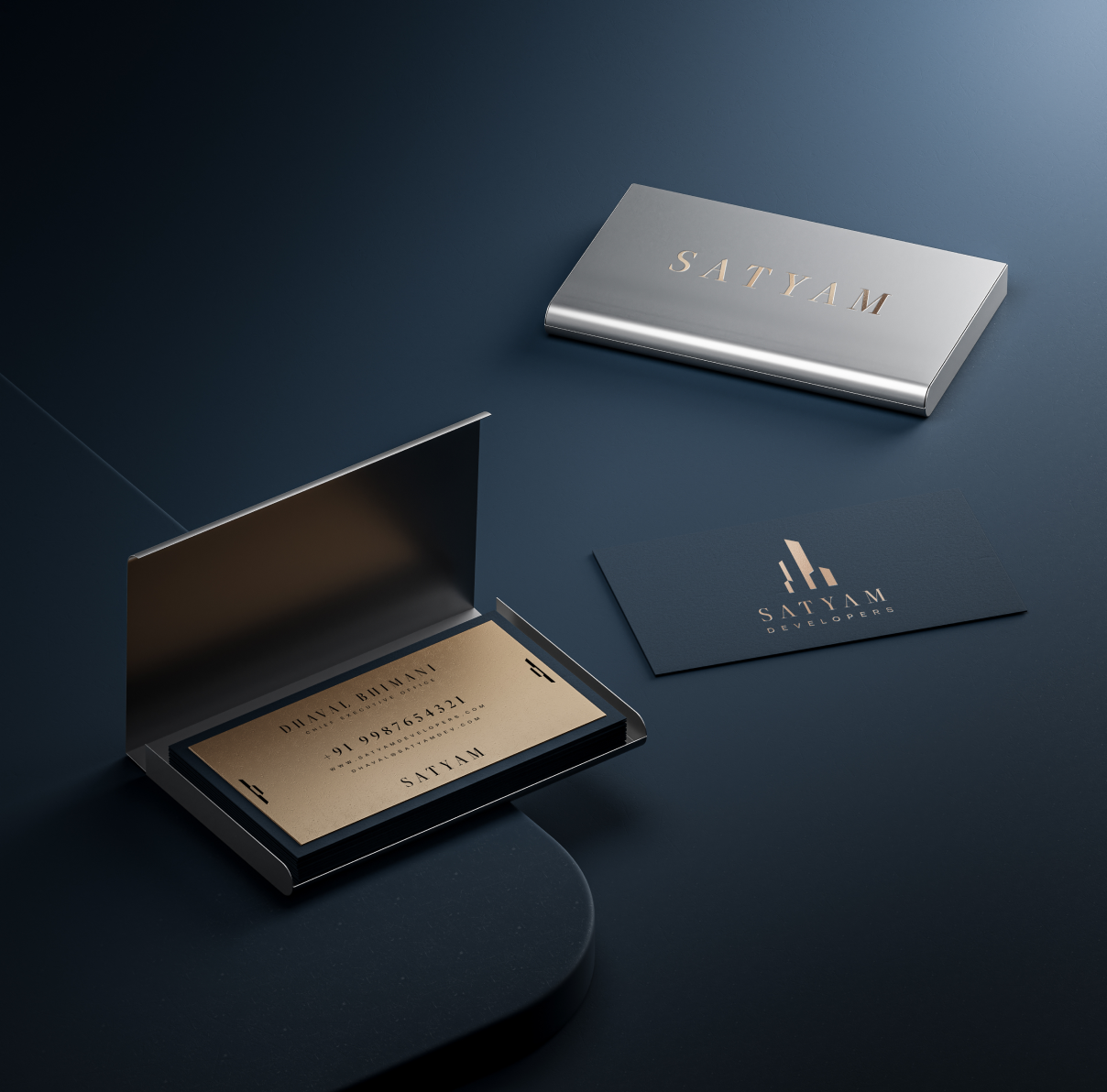
For Satyam Developers, we evolved their identity by preserving the essence of their legacy while refining it into a more modern, structured, and future-ready brand system. The logo was reconstructed using cleaner geometry and subtle dimensional depth inspired by architectural form, creating a mark that feels stable, refined, and enduring. A toned premium blue paired with soft gold and white established a sense of class and trust, while elegant serif typography added clarity and sophistication. We then translated this identity into a cohesive visual language, allowing the brand to extend seamlessly across its various collaterals while maintaining consistency, composure, and a strong architectural presence at every touchpoint.


2313 W Sam Houston Pkwy N, Houston, TX 77043, USA
F-90/10, Pocket F, Okhla Phase I, Okhla Industrial Estate, New Delhi, Delhi 110020
Here's where you can find us :
+91 97378 33335
503, Shilp Zaveri, Shyamal Cross Rd, near Iconic Shyamal, Ahmedabad, Gujarat 380015


.svg)