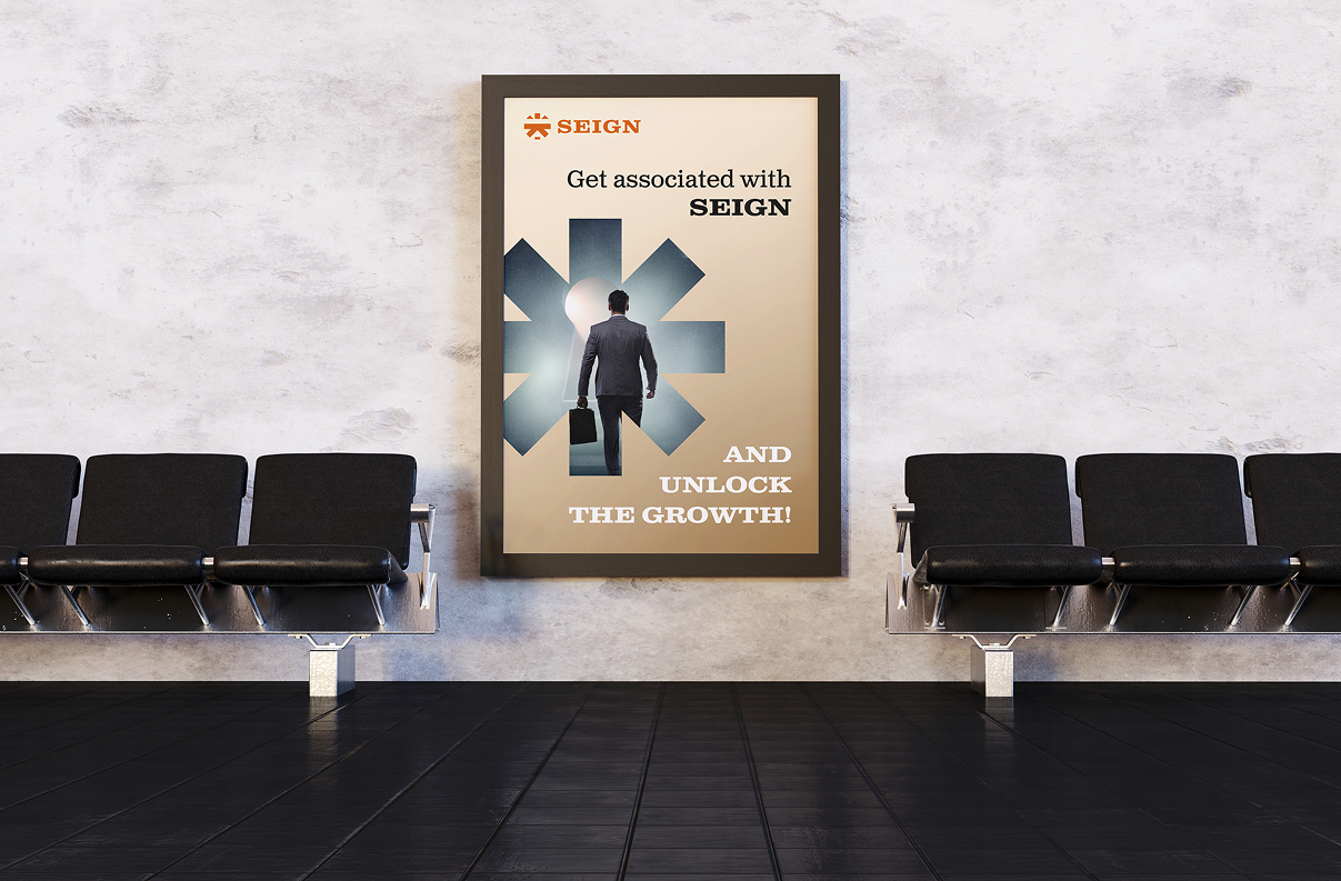
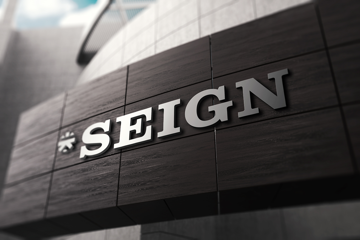
For Seign, we crafted a visual identity that subtly channels the strength and authority of a lion while keeping the symbol abstract and versatile. The core mark draws from a star form — representing rise, vision, and expansion — while also hinting at structural precision through geometric balance. The bold slab serif typography reinforces power and stability, creating a commanding yet timeless presence. A warm, classic color palette further strengthens the sense of legacy and sophistication. The identity was designed to be simple yet impactful, allowing it to scale confidently across various collaterals while also functioning harmoniously alongside sub-brands without overpowering them — creating a strong master identity built for growth.

2313 W Sam Houston Pkwy N, Houston, TX 77043, USA
F-90/10, Pocket F, Okhla Phase I, Okhla Industrial Estate, New Delhi, Delhi 110020
Here's where you can find us :
+91 97378 33335
503, Shilp Zaveri, Shyamal Cross Rd, near Iconic Shyamal, Ahmedabad, Gujarat 380015


.svg)